I have 5 easy tips for using color in Food Photography. Without sounding like Goldilocks, there’s a fine line between too colorful, dull, and just right when it comes to using color in food photography. You can easily end up with an image that looks like a dog’s breakfast. Or an image that looks black and white. A perfectly balanced and inspiring food photograph that will stop someone in their tracks and uses the perfect amount of color.
Color in food photography can be tricky so PHOOD is stepping in with some industry secrets on confidently using color in food photography.
Use 1-2 color pops for Food Photography
The eye usually moves to the brightest or most colorful part of your image. Too much color can be overwhelming and can distract your viewer from focusing on the hero subject. When thinking about color, PHOOD suggests adding one to two bright colors at most when composing your images. There are two main ways to add color to your photos:
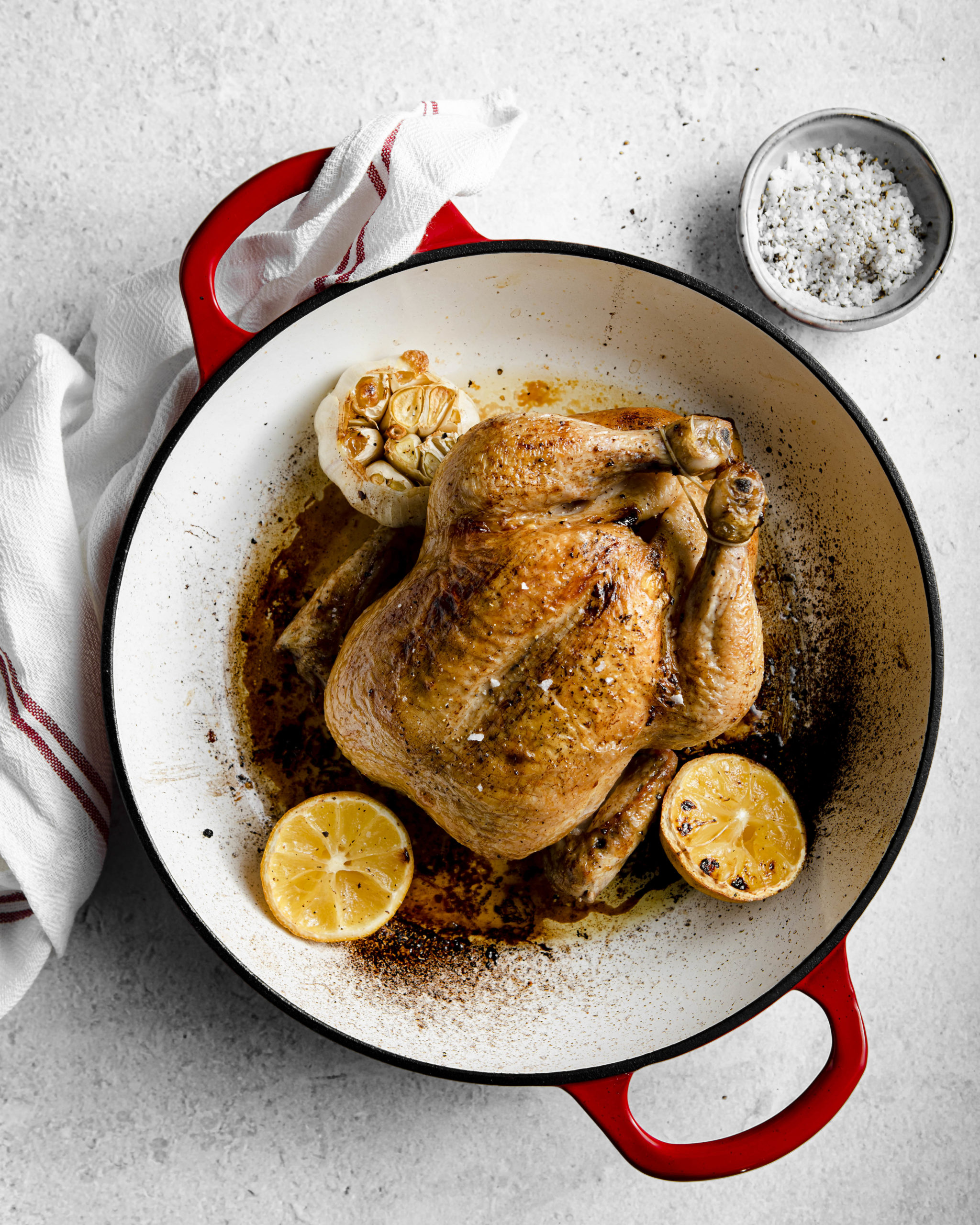
- Add color to the food. This is especially true for foods that are quite bland looking like porridge or meats for example. Add pops of color to lift the food in the form of extra topping ingredients or garnishes. For example, topping a porridge with fruit such as berries or figs would not only add texture and height but a much needed wash of color to an otherwise flat looking food. Herb garnishes and sides such as broccoli, carrots or green beans are a great way to elevate meats and other grilled items.
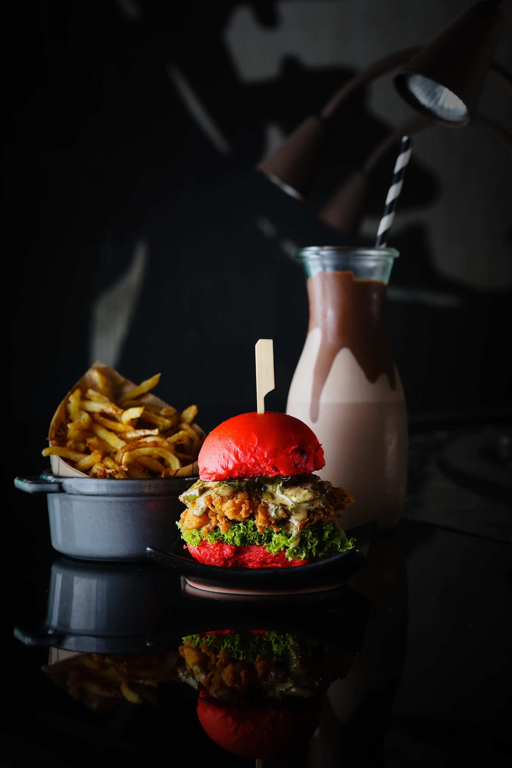
- Add color through props. You can do this by either choosing a background that has color or perhaps using certain small props which are more colorful. Pinch bowls, colored glasses small colored plates are a great way to achieve this.
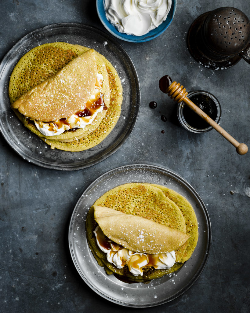
To master food photography, desaturate colors in post-production
One of the easiest ways to reduce color overwhelm and yet still use color is to desaturate certain individual colors in post production. This is easily done using the HSL color panel in Lightroom (PHOOD shows you the ins and outs of post production editing in our signature food photography course).
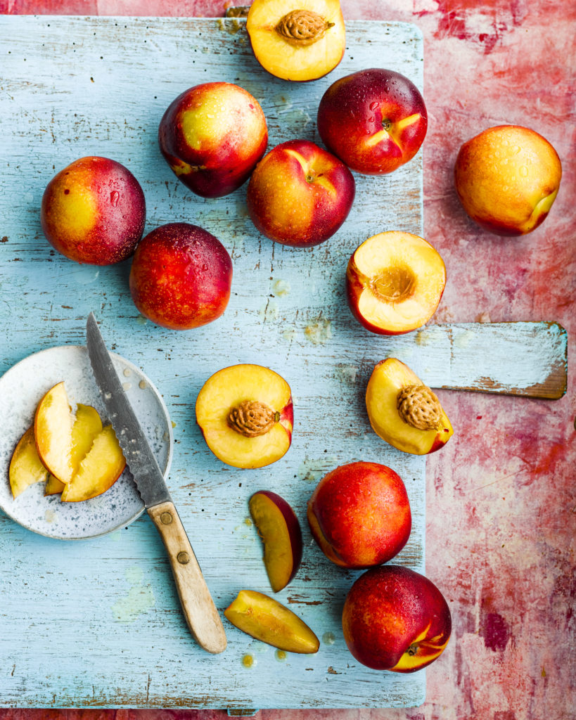
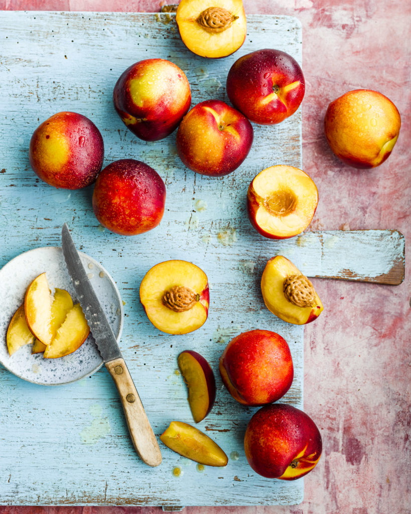
Take this reddish pink background PHOOD used to photograph stone fruit. The first image is SOOC without any color adjustments to the background. In the second image, the background was slightly desaturated. Whilst there is no right or wrong, desaturating (and even saturating!) is something to experiment with in post production.
Consider the color wheel
Deciding what colors to choose and what colors work best together can be confusing in food photography. The color theory and color wheel provide a great starting point to see what colors work best together.
The color theory has three basic color pairings:
- analogous
- monochromatic
- complimentary
Decide which fo the three color pairings you’d like to use and then pick props, backgrounds and garnishes accordingly. You’ll find more detailed color analysis inside PHOOD’s signature food photography course.
Adjust white balance as an alternative to achieve lively colors
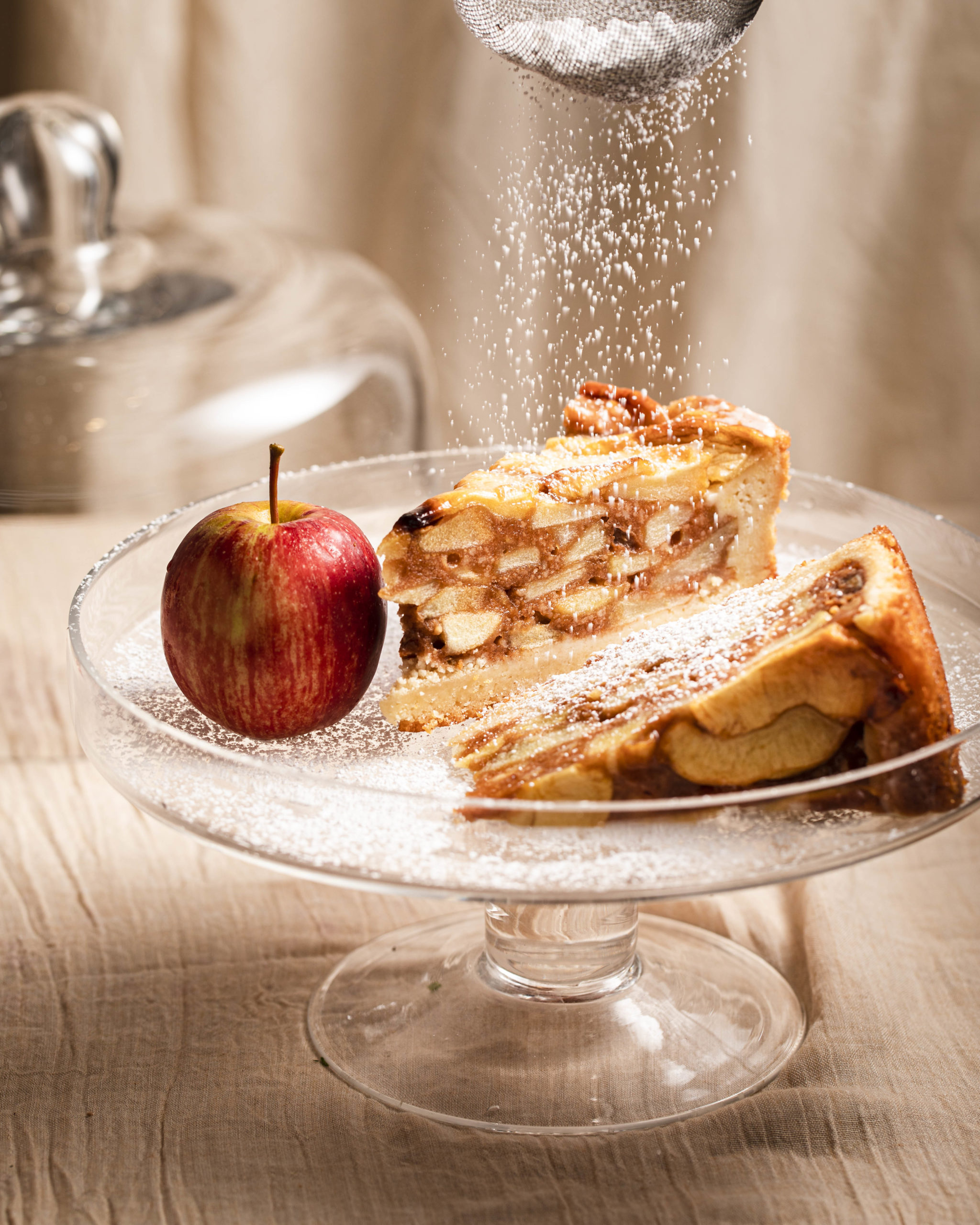
Using white balance is a great tool for story telling and enhancing warm and cool colors in post production. The white balance tool isn’t just a tool for balancing the color but can also be used for creative storytelling in post production. PHOOD used this technique for the two images below. one has a very warm color balance whilst the second image is much cooler. Both tell a very different story and again, there is no right or wrong. Here is an easy guide to custom white balance!
Consider contrast to enhance color
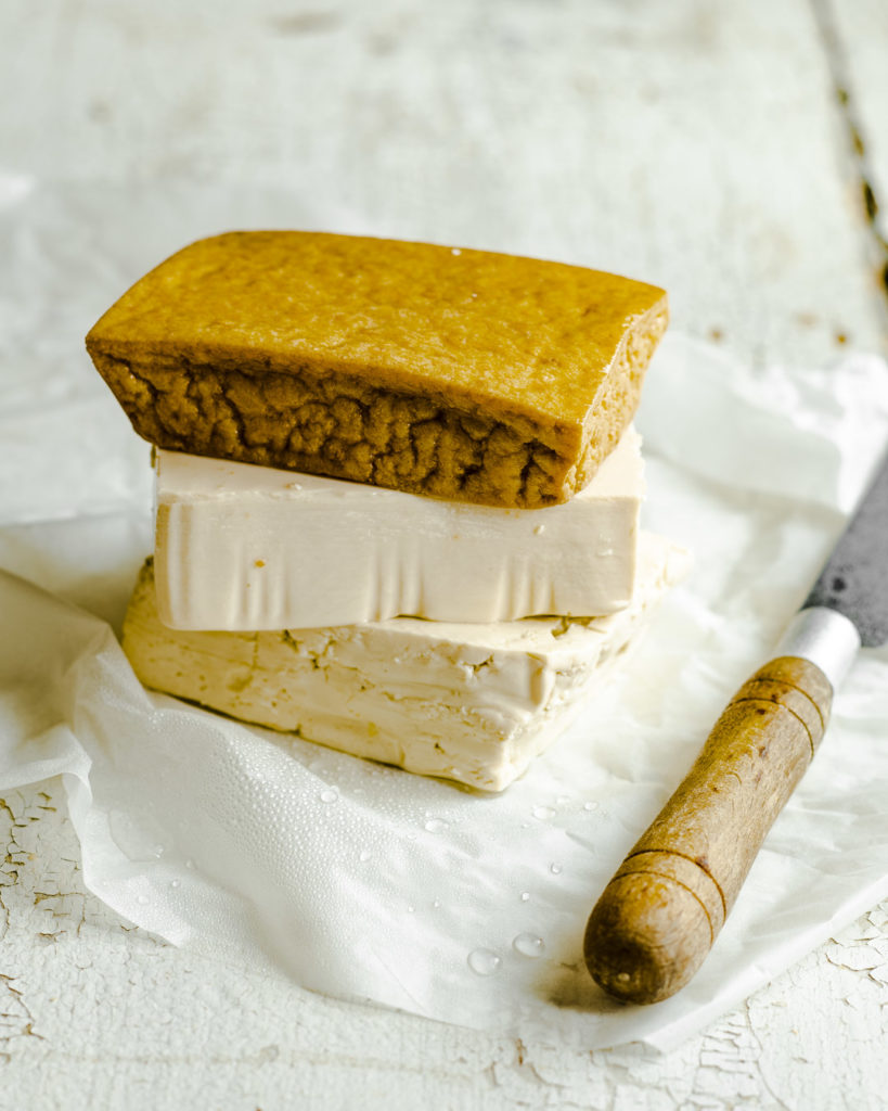
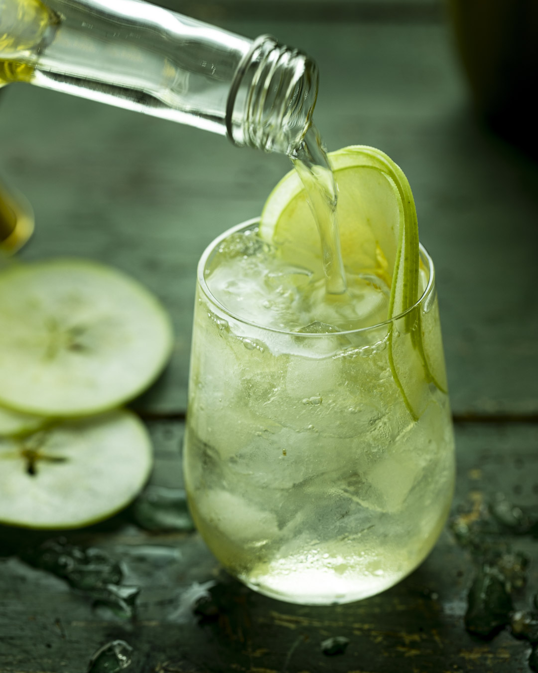
If you’re worried about using color to make your images stand out, contrast is another tool that can be used as an alternative. High key images with increased contrast can be perceived as being more colorful due to the individual colors being more saturated. There are many ways to increase contrast including moving closer to your light source, using foam cards as well as post production techniques such as the dehaze tool to achieve this.
PHOOD loves nothing more then intelligently using color in creative ways to stand out from the crowd. We hope the techniques we have described above will get you out of your shell and confidently start using color in your food photography.
+ show Comments
- Hide Comments
add a comment