Ever heard the saying ‘We eat with our eyes first.’ This saying is especially true for food photography. Color pairings in food photography is one of the easiest ways to decide which colors work together and which ones don’t.
Color is a powerful tool that can be used in food photography to give your audience a clue on what the food tastes like (red is considered spicy). It can also be used to evoke certain feelings (purple is considered regal). Color is also a powerful tool for story telling (green is considered healthy). You can highlight your focal point using color (the eye is attracted to the most color or saturated part of your image). As a result, your audience will connect with your food images.
How you pair certain colors together has a huge effect on the final outcome of your images. Some colors work perfectly together like a glove. Others not so much. Using the color wheel and color theory can take some of the guesswork out of choosing which colors to use. This works both on a micro level within the ingredients of a recipe as well as on a macro level for the overall image including props and backgrounds. Let’s look at three important color pairings every food photographer must be aware of to enhance their photography.
Monochromatic Color Pairings
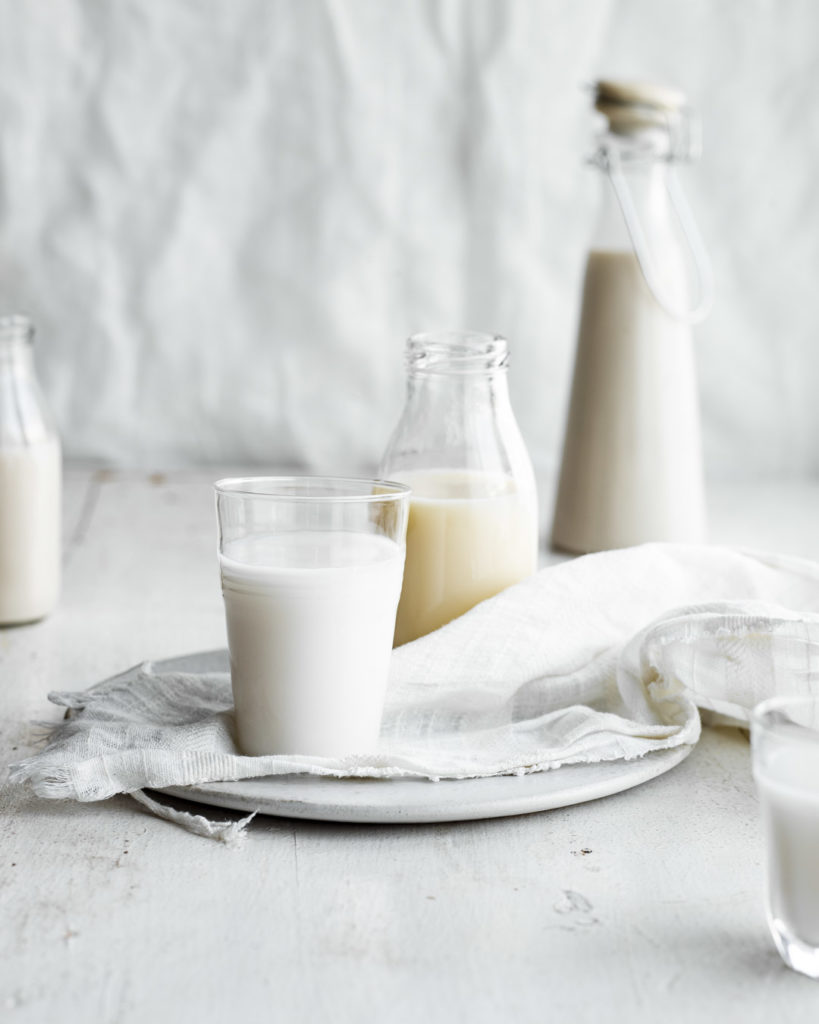
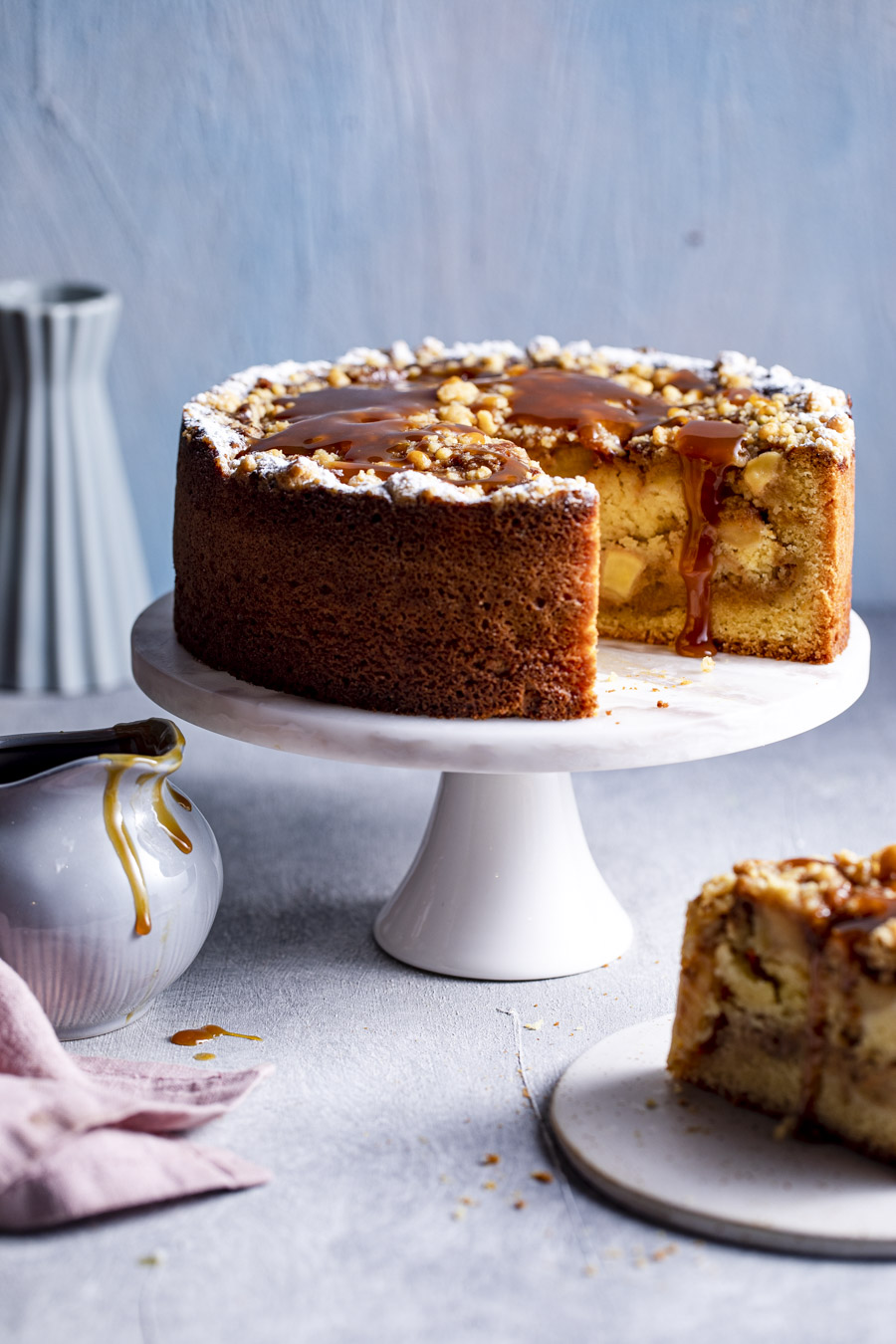
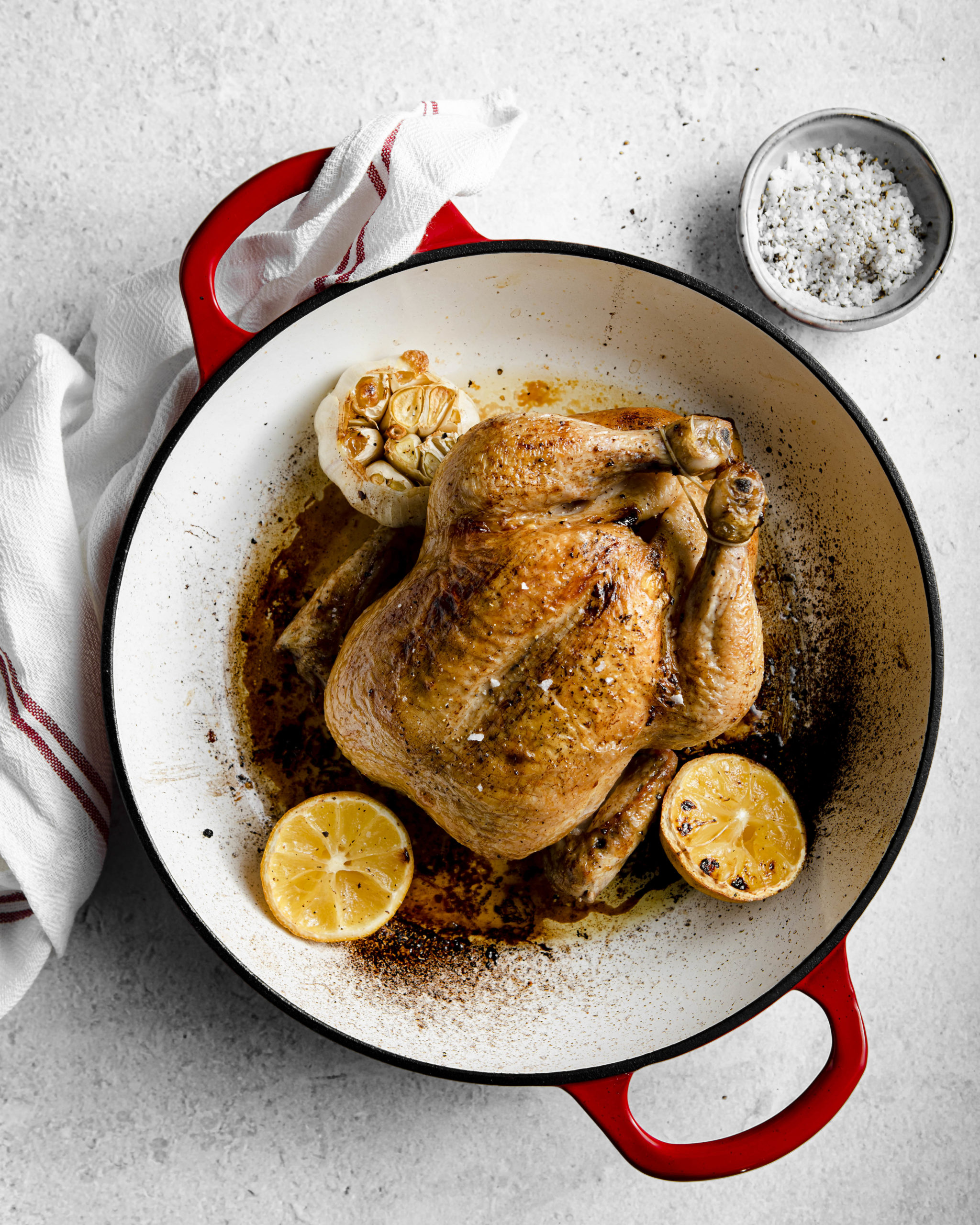
This is when an image has various shades / hues and tints of the same color. A monochromatic color pairing produces a calming effect on the eye and is considered subtle and delicate.
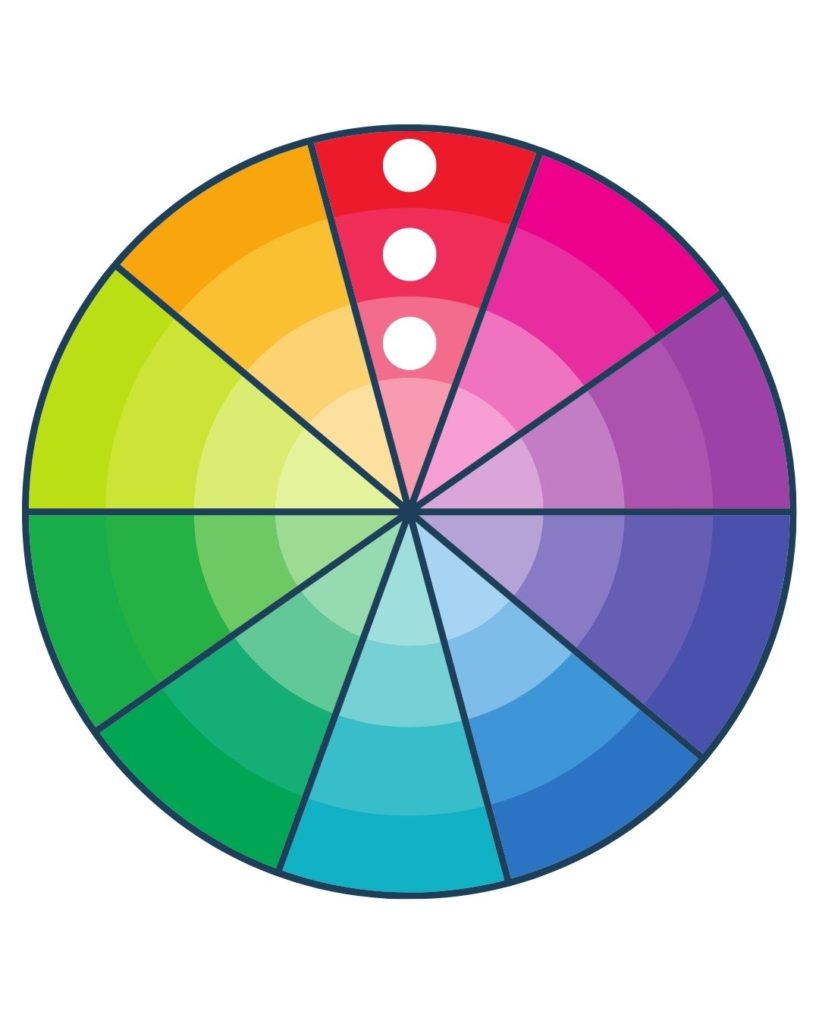
Analogous Color Pairings

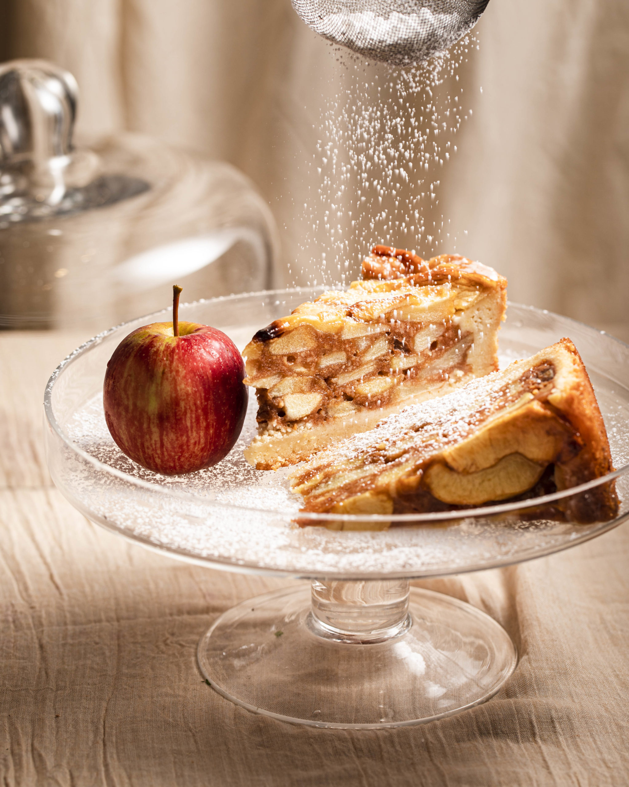
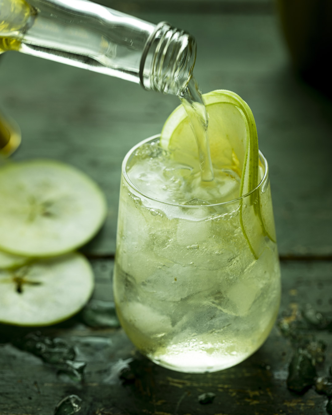
This is when an image uses colors that are right next to each other on the color wheel. An example would be to use red and pink in your image. Or perhaps blue and purple. Analogous color pairings are harmonious and work well without overwhelming.
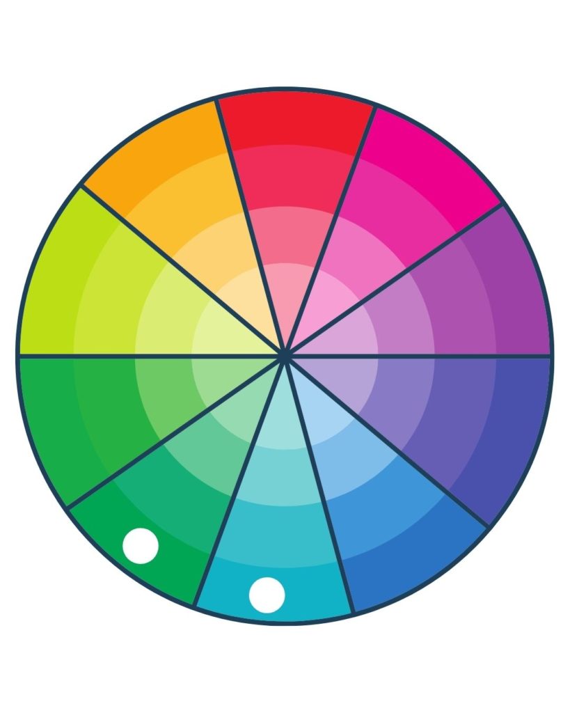
Complimentary Color Pairings
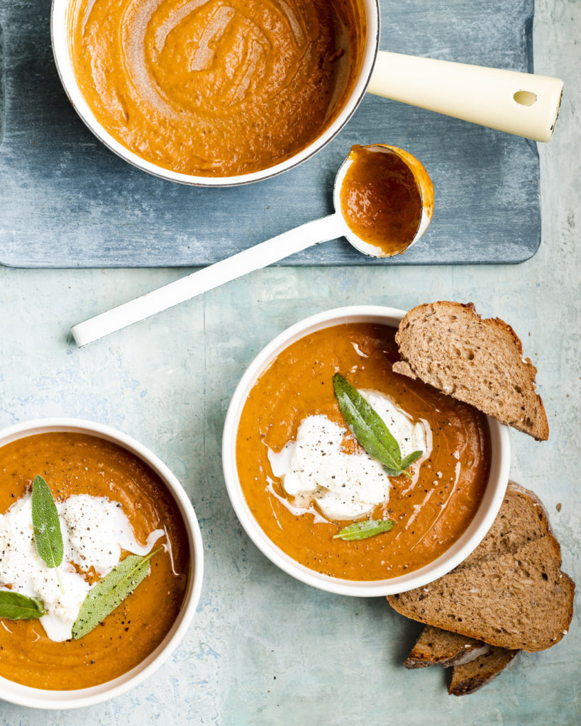
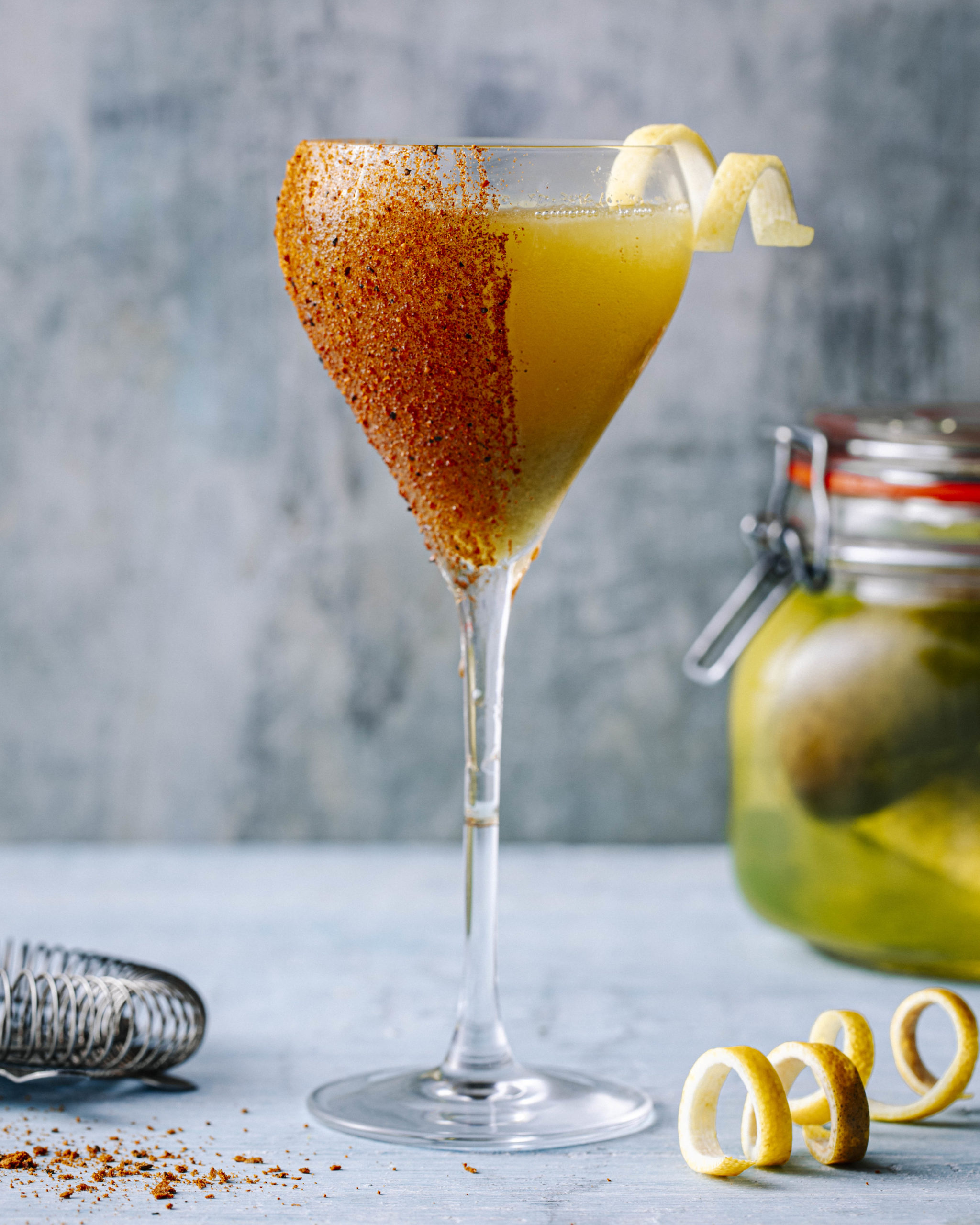
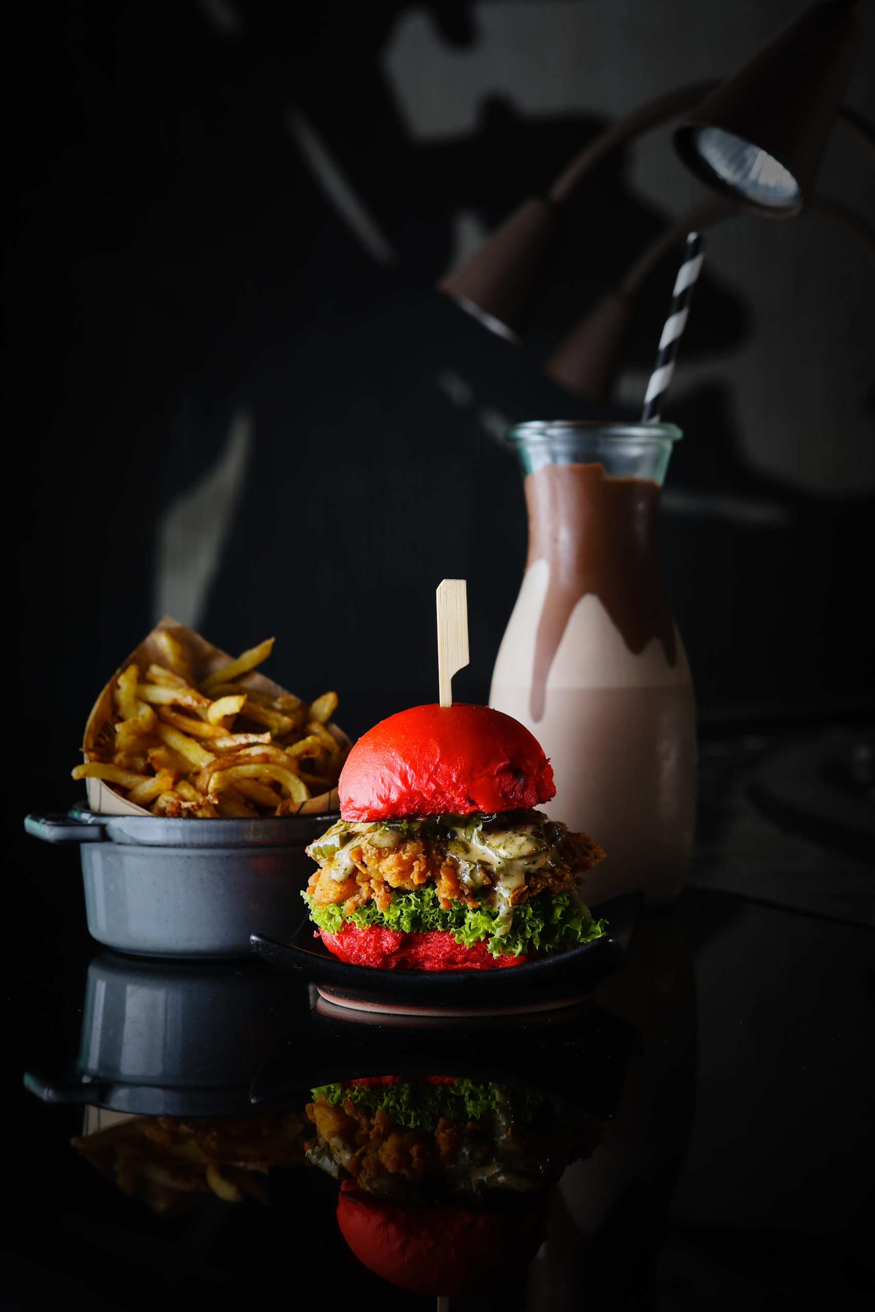
In this color pairing, an image uses colors that sit opposite each other on the color wheel. An example would be using red and blue in your images. This produces a dramatic image that’s full of contrast and gives dramatic vibes. The image is full of contrast and will pop off the screen.
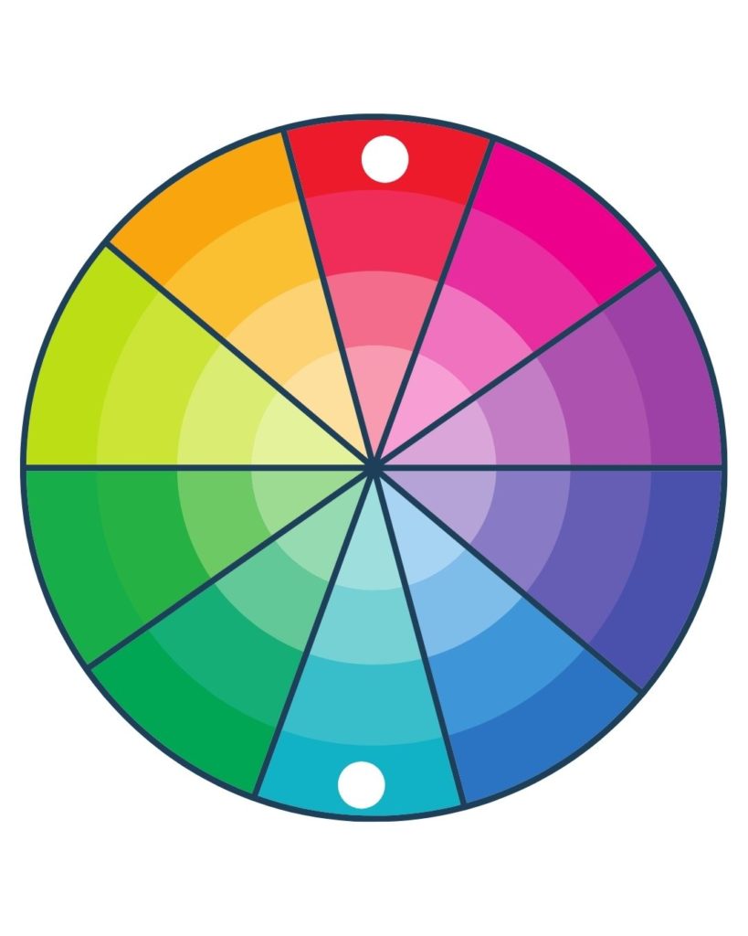
Using the color wheel and color theory helps a food photographer to understand how different colors work together and what color combinations to use to evoke different feelings and tell a different story. If you’re scared to introduce color to your images or not sure which colors work well together, refer to this blog post on how to subtly introduce colors in your food photography.
+ show Comments
- Hide Comments
add a comment